About

Projects

Kintsugi

During the “Type Design & Lettering” course workshop at IUSVE, we students were asked to create a fully modular font of our choice, using the principles and tricks learned throughout the course


The project was carried out in pairs.

Type Design

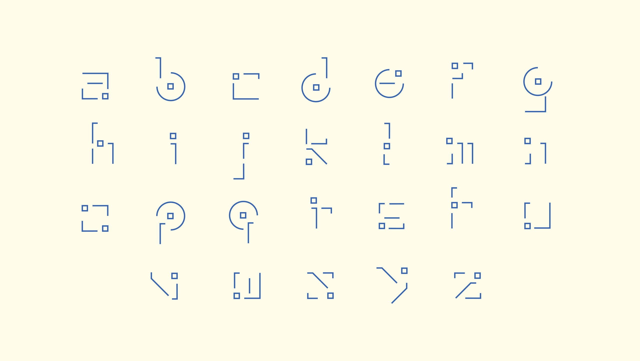
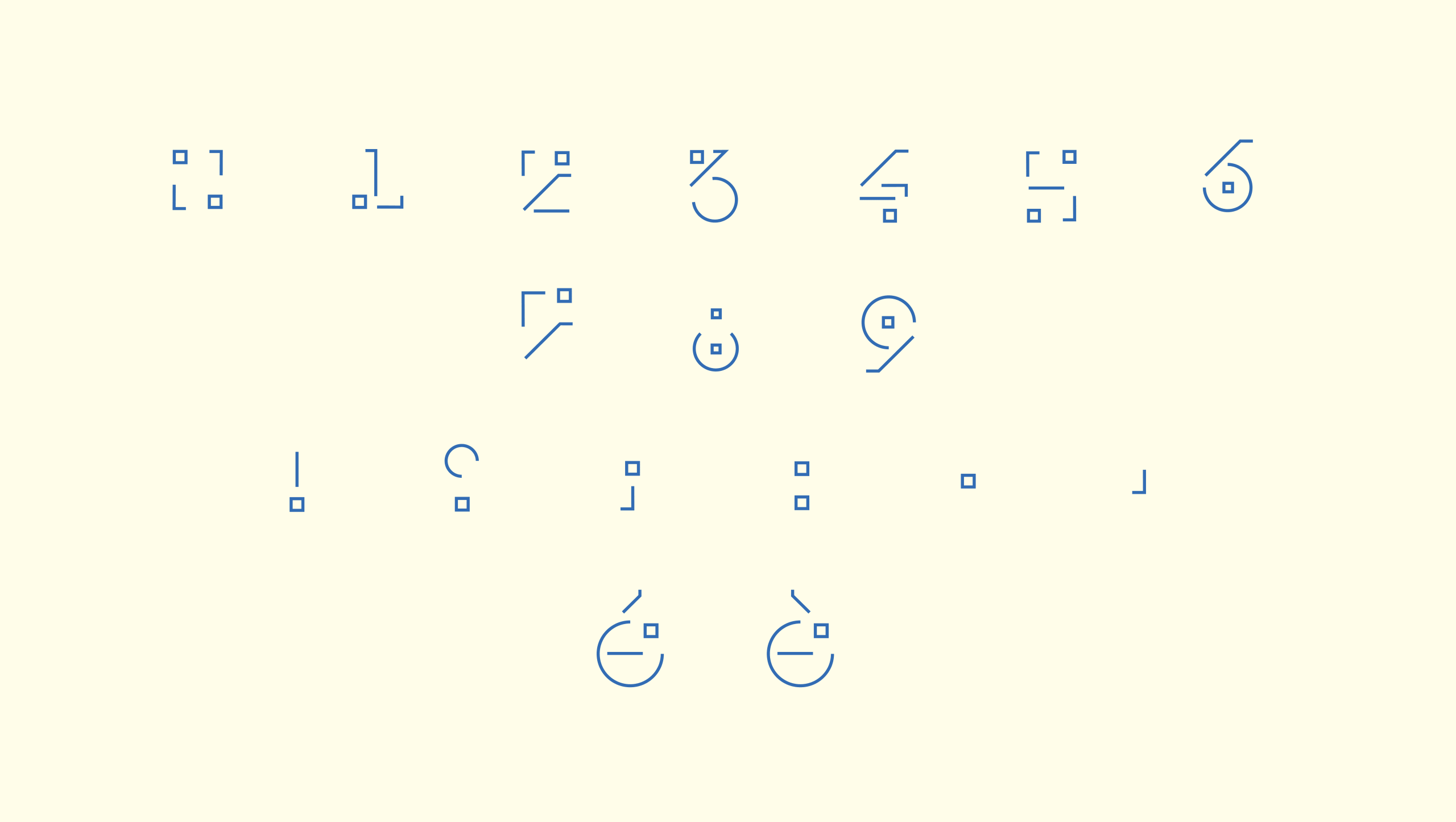
The project was born from a simple idea: to highlight the modular nature of the font and turn it into its defining feature.


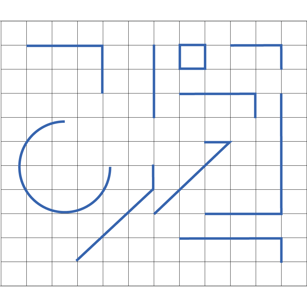
For this reason, we chose to keep the modules separate, without letting them merge or touch within the letters. In this way, the viewer can easily recognize the different building blocks that compose the font and repeat throughout the alphabet.

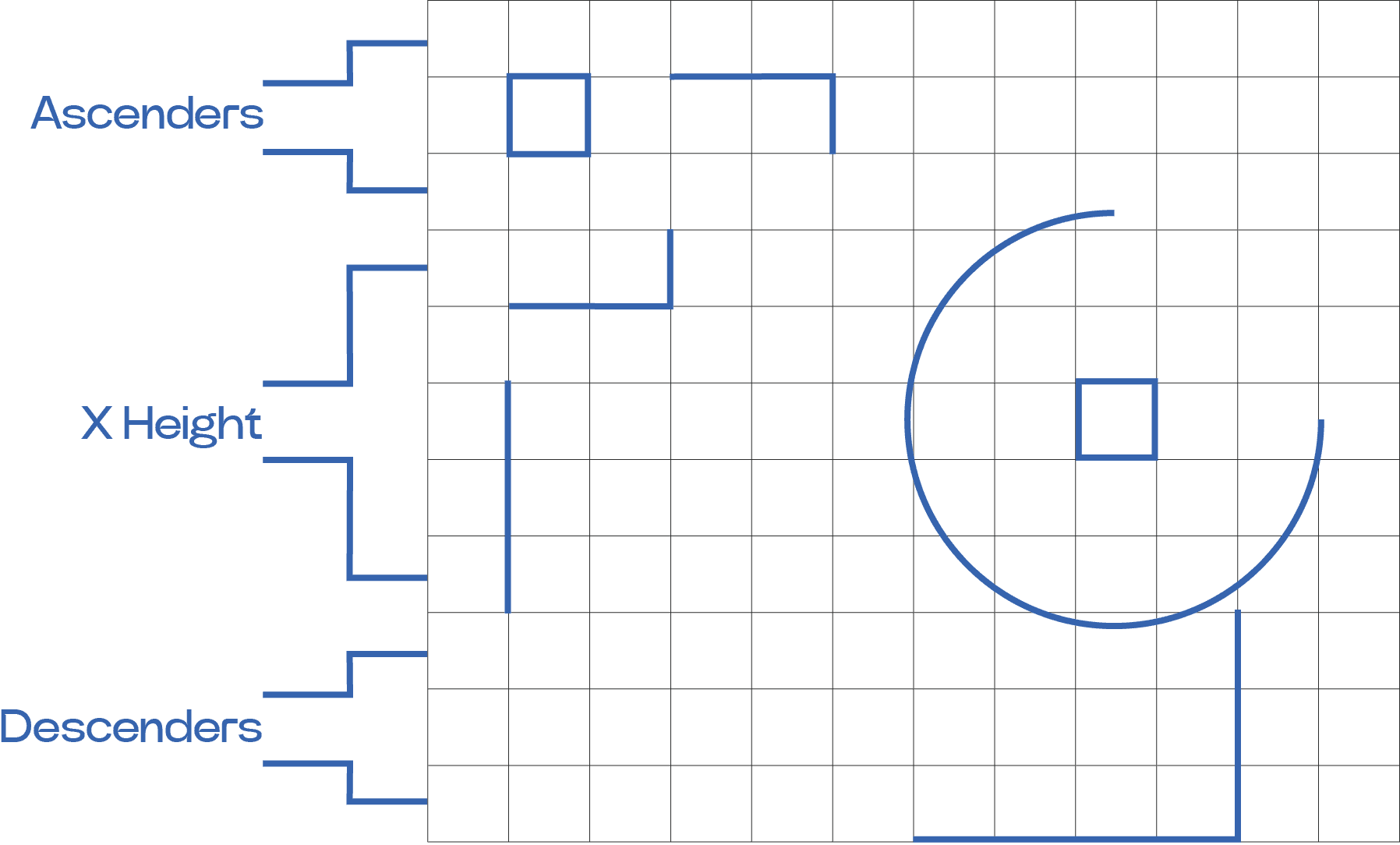
The modules were then arranged on a grid, designed to maintain the proportions between the ascenders and descenders of the letters.

The cracks and the space between the different modules become not only an integral part of the letter but also what distinguishes it and gives it value.


It is precisely from this characteristic of the font that its name, “Kintsugi,” originates—the ancient Japanese art of repairing ceramic objects using liquid gold, which became a symbolic way to celebrate an object’s history through its “wounds” or “fractures.”